RGB or CMYK? What I use? Isn’t that all the same, all colors? In this post I’ll explain briefly about the core differences about those and why this is so important when we create.
First of all – What the heck is RGB or CMYK?
RGB is for Red, Blue and Green.
CMYK is for Cian, Magenta, Yellow and BlacK.
Those two different colors systems make the magic of merge and create all the other colors. But why they’re different?
RGB are made for screens, it’s a color system that use light to form colors.
CMYK are made for printed things, it’s a color system that use paint to form colors.

To understand their differences, we need to understand how the colors are formed on those two places – digital and physical medias.
Digital vs. Physical
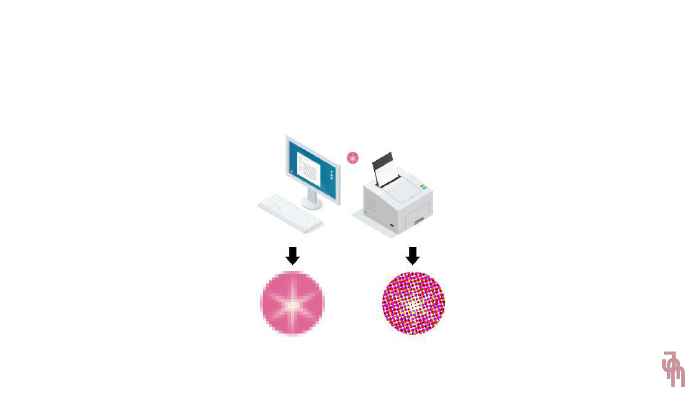
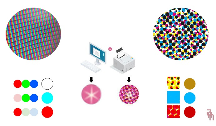
Digital medias show us pictures made of pixels. They use a grid of tiny points with different intensity of colors to display things.
Physical medias show us pictures made of dots of paint. They use mixed tiny dots with different sizes and colors to display things.
Digital medias use light to produce pictures, and physical medias use paint to produce pictures. We can conclude that digital medias use RGB and physical medias use CMYK.
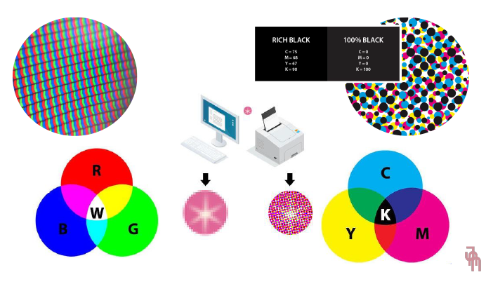
There’s some illustration for you understand what I’m talking about:

Technical differences
The main difference about RGB and CMYK system colors are simple, yet complex to understand.
Red, Green and Blue added up in RGB system results in white – they mix using different intensity of light and when they’re all merged, they subtract one to another.
Cian, Magenta, Yellow and Black added up in CMYK system results in black – they mix using different sizes and colors of paint and when they’re all merged, they add one to another. Fun fact about it – Black, only black, it’s lighter than all the CMYK colors together. That occurs because when we use only black paint, there’s just one layer of paint and the surface can absorb more of that paint. When we use the black result of CMYK mix, we call it Rich Black – there’s four layers of paint and the surface can absorb just an amount of all that paint, increasing the amount of “black” paint. Rich black smudge easily, so be careful and do not use it in thin lines or things that have a lot of tiny details.

Color differences
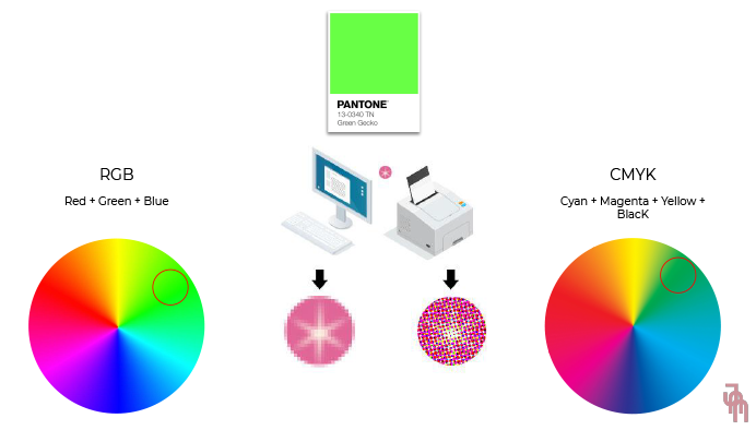
The difference that is really discernible in our eyes is the difference of those colors when we try to convert one system to another. We’ll never get the same RGB when print it in different printers, and also we’ll never get the same CMYK when display it in different screens. That’s because every software reads and adapts the system colors differently.
When you plan your creations, be sure what you want to do with them – if you want to print it, make it in CMYK; if you want to post it online, make it in RGB; if you want both, make sure they are at least similar when print/display.
Keep in mind that RGB have brighter colors that CMYK never could get. Also, CMYK have a large range of matte colors with small differences that RBG never could get.

How I can have the same colors every time?
You don’t.
Really.
Every display have a large range of differences – some are led, some are brighter, etc. We can’t manage to display it equally at all.
This also occurs with printed things – some paints are darker, some papers are brighter, etc. We can’t control all the production process.
However, there’s a famous company that makes our life easier – Pantone.
They catalogue every color and put a code in it, that can be used to identify this particular color in order to apply it in everything you can imagine – paper, cloth, screen, metal, etc. The more reliable source for getting the Pantone Color is seeing it with your own eyes, physically, using their guide – as I mentioned before, displays have a large range of differences that can’t reproduce it properly.

I hope you enjoy this content! If yes, spread some love with your friends and coworkers sharing this article!
If you’re searching for more, you can send me an email and I can make you an proposal of training, based on your needs – hi@jnnagasawa.com
And, as always, thank you for reading this!
Graphic designer with more than 10 years of experience in advertising. Brazilian, born in Japan. Founder of JNN Design, she offers services related to digital marketing, visual communication solutions, and advertising consulting. Partner and certified by Google Ads and Facebook Blueprint.